History of the Cadbury Oreo Chocolate bar
What product have I chosen and why?

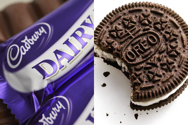
the audiences. Furthermore, this product is the combination of 2 products that audiences love to have. This product clearly has an element of synergy. This means that I can get twice as much of the audiences to be watching this advert.
When did Cadbury first launch the product?

meant that the feedback that Cadbury got determined if the product was a success or not. However, due to the rebranding, this chocolate bar has been relaunched continuously over the last few years.
Who do you think is the audience for the product?
because this product is a combination of various flavours that is enjoyed by these specific ages.
Describe the packaging.

and purple colour scheme. This showed the synergy between 2 of the products (Oreo and Cadbury). The current design of the product is a very simplistic view. This was useful as it shows formality and informality to it audiences. In other words, audiences are drawn to pick up this product and eager to take a bite of it.
An example of an old advertisement campaign.
Analyse the advert.
Description of packaging.
The packaging itself contains a simple colourful scheme: purple and blue. This is helpful for audiences as they can see the overall brands that are joint together. The packaging also contains two main ingredients that will make audiences chose because it is tasty and is not too powerful.
Slogan.
The slogan states "Twice the joy". This means that there are two elements that means that there is more flavour inside the chocolate. Therefore, this also shows that customers are more attracted to this chocolate as this product has more to offer.
Luxury? On the go? Everyday?
This product can be for every day. This is because it has ingredients that are simple and enjoyable for all customers. Moreover, this can lead to customers buying more of it. Also, this product has two main elements that bring the whole chocolate together.
Potential Target Audience?
In my opinion this chocolate is for everyone. This is because it is a simple but elegant chocolate that isn't too luxurious for customers. This should be highly recommended to everyone as the ingredients are very tasty and basic.
What ideas might you use to keep the brand consistency?


No comments:
Post a Comment